Getting started with talwind

Tailwind CSS doesn’t provide ready-made building blocks for your layouts like Bootstrap or Material Design but also does not focus on writing everything.
installation:
 Step 1:npm init -y.
 Step 2:npm install tailwindcss.
 Step 3:Use the @tailwind directive to inject Tailwind's base, components, and utilities styles into your CSS
 file. @tailwind base; ...
 Step 4:npx tailwindcss init. ...
 Step 5:npx tailwindcss build styles.css -o output.css.
Method 2: Using Tailwind through CDN
<-- add it to the head section of the html file -->
<link href="https://unpkg.com/tailwindcss@^1.0/dist/tailwind.min.css"
    rel="stylesheet"
Let’s see how it looks in practice:
<div class="bg-green-300 border-green-600 border-b p-4 m-4 rounded">
  Hello World
</div>
- bg-green-300 – this class sets a green background. The value 300 in the name is just the shade number.
- border-green-600 – it’s similar to the previous class but it sets the elements borders colour to a slightly darker green.
- border-b – this class does nothing more than set the border to be visible only at the bottom (“b” stands for “bottom”)
- p-4 and m-4those two classes make the margin and padding the size of 4 units. In Tailwind CSS, this is equivalent to 16px.
- rounded– finally, this sets the rounded corners for the element.
With all those classes the final effect will look like this:

If you don’t like the round corners, you can always adjust them. The rounded class has many varieties, such as rounded-sm or rounder-lg, that give the element corners a smaller or larger radius of rounding, respectively. It is also possible to round off only the selected corners.
However, Tailwind CSS is different., for example, you want a class to be active only when the user hovers the cursor over the button, it’s enough to precede such class with the prefix of the CSS pseudoselector, e.g. hover:
<div class="bg-gray-500 hover:bg-red-600 ..."></div>

Responsiveness
If you want some classes to be active for a given view, you precede them with a prefix denoting a specific screen size, e.g. ‘sm’ for larger phones, md for tablets and lg for monitors. The class without prefix will then only be used for the smallest screens.
<div class="m-2 sm:m-4 md:m-8 lg:m-16 xl:m-32"></div>
flexbox:- The CSS flexbox is a great feature to develop the frontend. In tailwind CSS all the properties are covered as in class form.
flex-row
     <div id="main" class="flex flex-row justify-center">
        <div class="bg-green-900 w-24 h-12">1</div>
        <div class="bg-green-800 w-24 h-12">2</div>
        <div class="bg-green-700 w-24 h-12">3</div>
        <div class="bg-green-600 w-24 h-12">4</div>
        <div class="bg-green-500 w-24 h-12">5</div>
        <div class="bg-green-400 w-24 h-12">6</div>
    </div>
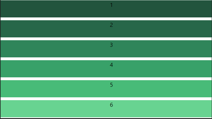
flex-col
    <div id="main" class="flex flex-col gap-y-2">
        <div class="bg-green-900 w-30 h-12">1</div>
        <div class="bg-green-800 w-30 h-12">2</div>
        <div class="bg-green-700 w-30 h-12">3</div>
        <div class="bg-green-600 w-30 h-12">4</div>
        <div class="bg-green-500 w-30 h-12">5</div>
        <div class="bg-green-400 w-30 h-12">6</div>
    </div>
output
Grid:- This class accepts more than one value in tailwind CSS all the properties are covered as in class form It is used to set the number of columns and size of the columns of the grid, here we will do the same but for fast development of front-end. The number of columns is set by the number of values given to this class. Grid Template Columns:
grid-cols-1: Each row concedes only one column.
grid-cols-2: Each row concedes only two columns.
grid-cols-3: Each row concedes only three columns.
grid-cols-4: Each row concedes only four columns.
grid-cols-5: Each row concedes only five columns.
grid-cols-6: Each row concedes six columns.
grid-cols-7: Each row concedes seven-columns.
grid-cols-8: Each row concedes eight columns.
grid-cols-9: Each row concedes nine columns.
grid-cols-10: Each row concedes ten columns.
grid-cols-11: Each row concedes eleven columns.
grid-cols-12: Each row concedes twelve columns.
grid-cols-none: Does not follow the grid-column property.
   <div id="main" class="grid grid-cols-3 gap-1 justify-evenly">
        <div class="bg-green-700 w-26 h-12">1</div>
        <div class="bg-green-500 w-26 h-12">2</div>
        <div class="bg-green-300 w-26 h-12">3</div>
        <div class="bg-green-700 w-26 h-12">4</div>
        <div class="bg-green-500 w-26 h-12">5</div>
        <div class="bg-green-300 w-26 h-12">6</div>
    </div>


